A page can look finished and still leave questions unanswered
You have a polished landing page, paid traffic and a contact form. Yet visitors are not taking the next step. The design may be attractive while the offer is unclear, the form fails on a phone or the page never explains what happens after someone enquires.
A conversion audit follows the visitor’s journey and records specific problems. It should produce evidence, affected URLs and a practical order of work. This guide shows how to review one service landing page before spending more money to bring people to it.
1. Record the starting point
Choose the exact URL and the traffic source you want to review. Save the ad or campaign message, intended audience, main conversion action and observation date. If different campaigns reach the page with different promises, note that before changing the headline.
Keep a simple issue log with the page URL, section or element, device, observation, screenshot, suggested fix and verification step. For a broken image, include the image source URL as well as the page where it appears.
Separate observations from assumptions. A button hidden behind a sticky widget is an observed problem. Assuming that a particular shade of green is causing low sales is a hypothesis that needs evidence.
2. Compare the promise with the first screen
Read the ad and the landing-page opening together. Does the page continue the same offer? Can the visitor recognise the service and understand the next action without studying a paragraph of general agency language?
Google’s landing-page guidance recommends aligning the destination with the ad, providing useful information and making the next action easy to complete. That supports a clear journey, not a universal page template.
Write the offer in ordinary language. Explain what is available, who it is for and what the first step involves. A broad slogan can support the brand, but it should not carry the entire explanation.
3. Check the decision information
A prospective client may need to know what the service includes, what they must supply, who handles the work and what happens after contact. A page that skips those questions can create uncertainty even when the visitor is interested.
Look for unsupported claims and replace them with useful evidence or a more precise explanation. If you show a result, state the context and relevant limitations. Use testimonials only with permission and an accurate source.
Do not add every possible paragraph to one page. Answer the essential buying questions, then use contextual links where a deeper explanation becomes helpful. Our internal linking guide explains that approach.
4. Review on a real phone and a laptop
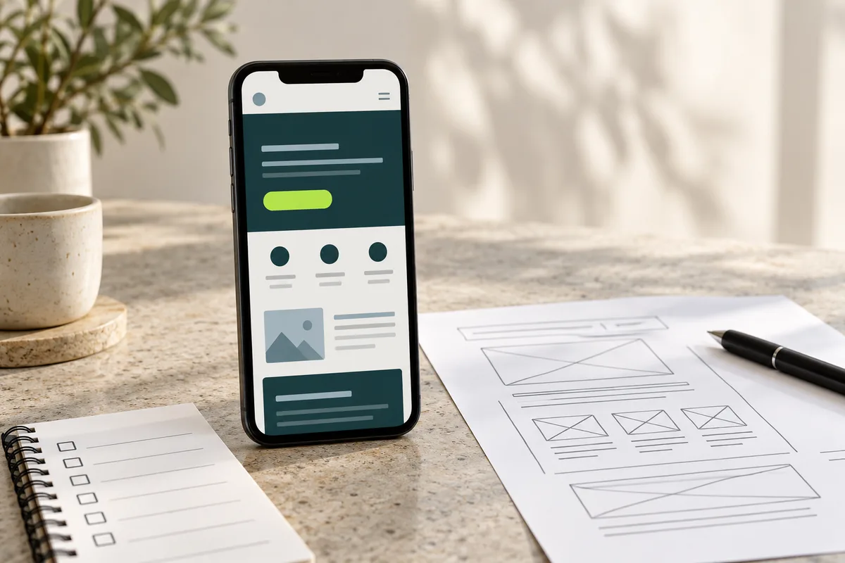
Open the page on the devices your visitors use. Inspect the first screen, navigation, headline, images, form and confirmation. Check whether text wraps naturally and whether fixed headers, review badges or cookie controls cover the content.
Try a smaller laptop window as well as a large display. A layout that works at one desktop width can still cut a button or force a long heading outside its container elsewhere.
Record the exact viewport and screenshot for each layout issue. Telling a developer that mobile looks wrong leaves too much interpretation. Showing the affected URL, element and width makes the fix reviewable.
5. Complete the form yourself
Submit a clearly labelled test enquiry through the actual visitor flow. Confirm required fields, invalid entries, error messages, successful submission and delivery to the correct system. A success message on the page does not by itself prove that the team received the enquiry.
Check labels and keyboard behaviour. Google’s web.dev form accessibility guidance explains why form controls need associated labels. Its autofill guidance explains support for previously entered information.
Ask only for details needed at this stage. Keep the purpose of each field clear, and explain the expected response rather than leaving people wondering whether they should submit again.
An illustrative audit finding
Imagine a consultation page whose ad offers a short project review. The page says only submit, asks for ten required fields and does not explain the next step. On a smaller screen, a floating badge covers the last field. This is a hypothetical example, not an audit of a client.
The issue log would contain separate findings: unclear action wording, unnecessary information at the first step and an overlapping interface element. Each needs its own verification. Changing the headline alone would not resolve the covered field.
A useful fix could clarify the review, reduce the initial information request where appropriate and reposition the badge. Test the complete journey again after those changes.
6. Use performance tools to find a specific problem
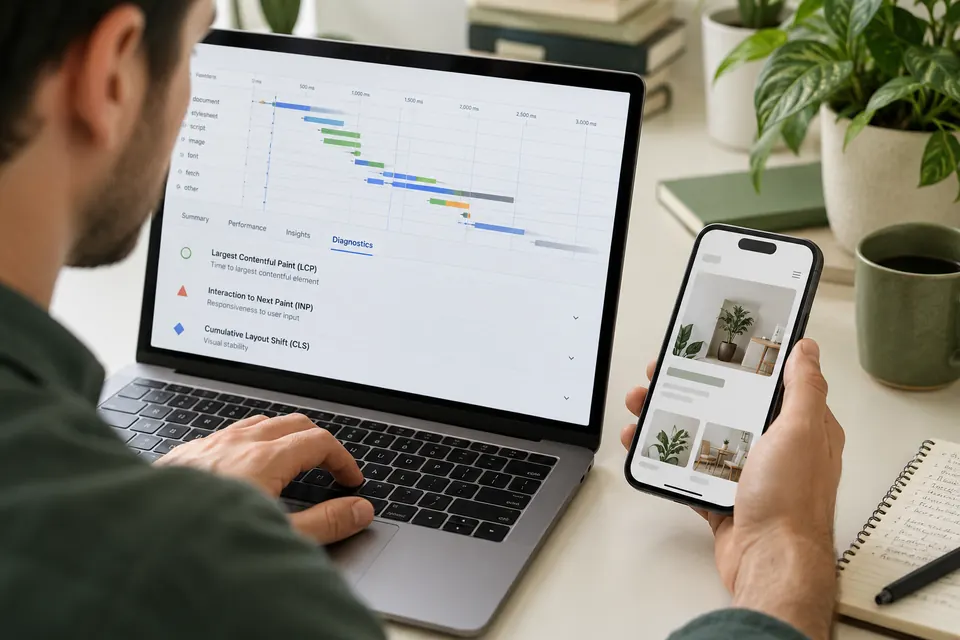
A speed report can identify a slow-loading image, blocking resource or other performance issue. Keep the tested URL, device mode, test conditions and affected resource link with the result. A score without context is difficult to turn into work.
Start with problems that interfere with reading or taking action. Check whether a large hero image is delaying useful content or whether animation makes the form hard to use. Do not remove necessary functionality merely to improve a number.
Automated tools cannot fully judge whether the offer is understandable. Combine their observations with the manual message, layout and form checks in this guide.
7. Verify what your conversion event represents
Confirm whether the measured action is a successful enquiry, a button click or a page view. Those are different events. A click on a contact button may show interest without confirming that a message was sent.
Use a controlled test to check duplicate events and the relationship between the website, analytics and CRM. Review measurement under the actual privacy choices available to visitors. Do not treat missing optional tracking as proof that a form failed.
Then assess enquiry quality. Our lead quality guide helps separate submission volume from useful conversations. Our Google Ads lead-tracking guide explains a later sales-status workflow.
8. Prioritise fixes by evidence and impact
Put broken submission flows, unreadable content and blocked controls ahead of cosmetic preferences. Next, address clear offer mismatches and missing decision information. Keep lower-confidence design ideas in a separate test list.
Assign an owner and an acceptance check to every agreed fix. For an image issue, that might mean the correct asset loads at the expected size without cropping essential content. For a form, it means the test enquiry reaches the intended destination.
Review the page after deployment, not only inside an editor preview. Shared headers, third-party widgets and production settings can change the actual experience.
What should the finished audit contain?
Keep a concise summary of the main problem, followed by specific findings with page and resource URLs, screenshots, device context, recommended action and a way to confirm the result. Mark unknowns where account access or business information is needed.
A public-page review cannot prove every internal sales or reporting issue. State that limitation rather than presenting an automated score as a complete diagnosis. After the fixes, compare similar periods and account for changes in traffic quality.
For help, explore conversion-rate audit services and landing-page design. Our clicks without leads guide provides a broader campaign perspective.
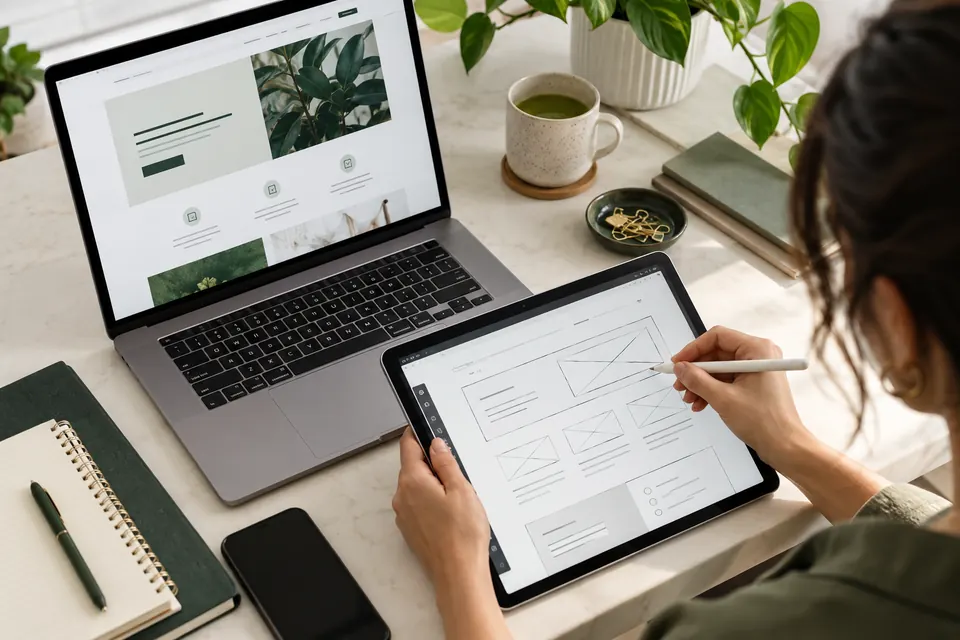
Editorial note: this original guide was prepared with AI assistance on 27 October 2026. The consultation-page example is hypothetical. The featured image is an AI-generated editorial scene, not a screenshot of a live audit.